Reimagining Hotel Murano
Visual Identity & Brand Storytelling
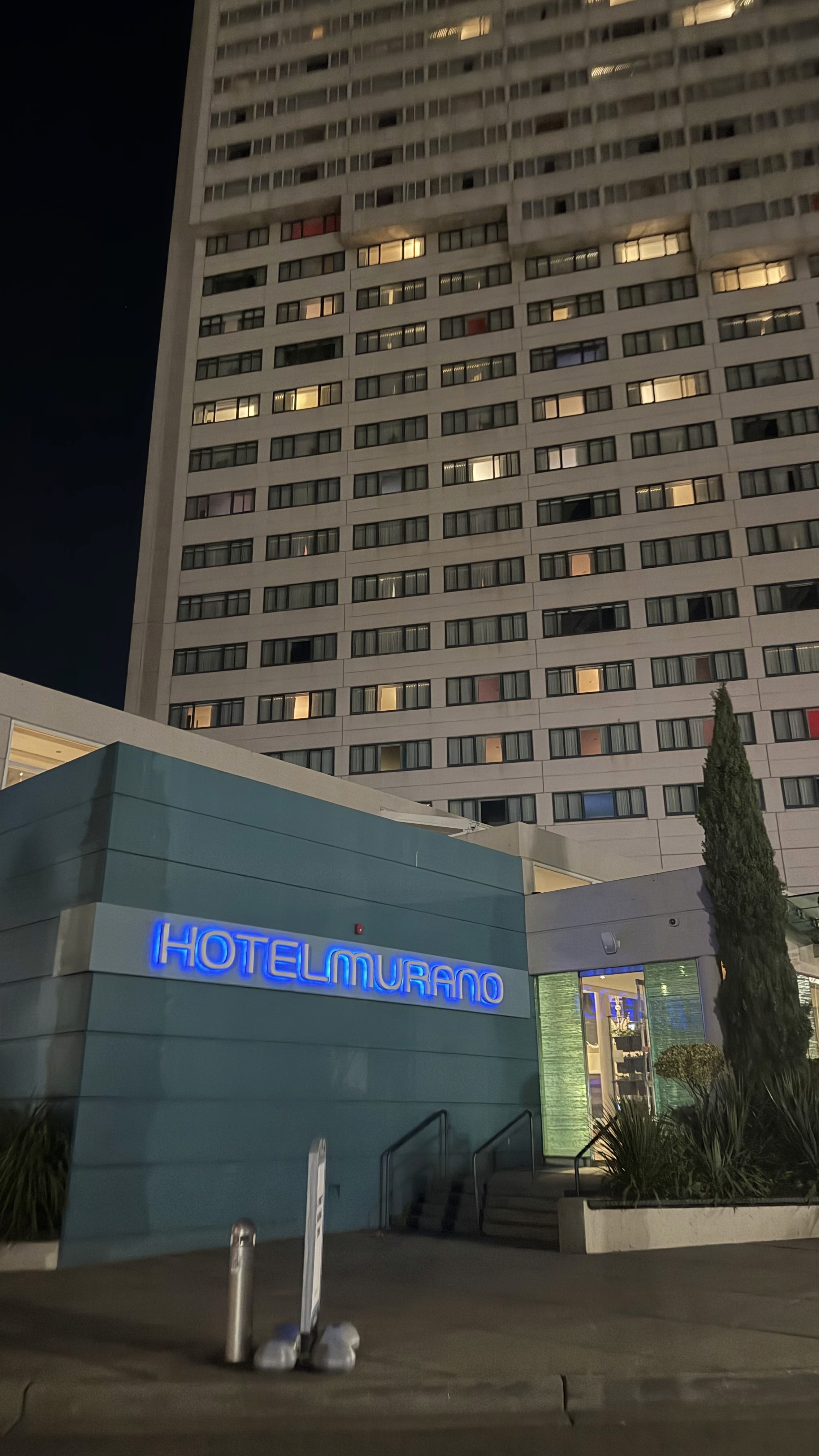
In the heart of downtown Tacoma's bustling art scene lies Hotel Murano. Surrounded by world-renowned glass art, Hotel Murano markets itself as luxurious, inspirational, and artistically exploratory.
This rebrand aims to position the hotel in visual alignment with its brand messaging.
Duration
11 weeks
ADVISED BY
Gabriel Stromberg
Team
Solo Project
MY ROLE
Brand Strategist
Systems Thinker
TOOLS
Figma
InDesign
Illustrator
Reimagining Hotel Murano
Reimagining Hotel Murano
Visual Identity & Brand Storytelling
In the heart of downtown Tacoma's bustling art scene lies Hotel Murano. Surrounded by world-renowned glass art, Hotel Murano markets itself as luxurious, inspirational, and artistically exploratory.
This rebrand aims to position the hotel in visual alignment with its brand messaging.
Duration
11 weeks
ADVISED BY
Gabriel Stromberg
Team
Solo Project
MY ROLE
Brand Strategist
Systems Thinker
TOOLS
Figma
InDesign
Illustrator
“In honor of Tacoma’s place in the
American glass art movement, Hotel Murano pairs luxurious guest rooms and well-appointed event space with a museum-worthy collection of glass art from around the world."
“In honor of Tacoma’s place in the
American glass art movement, Hotel Murano pairs luxurious guest rooms and well-appointed event space with a museum-worthy collection of glass art from around the world."
“In honor of Tacoma’s place in the
American glass art movement, Hotel Murano pairs luxurious guest rooms and well-appointed event space with a museum-worthy collection of glass art from around the world."
the challenge
the challenge
Their current branding doesn't reflect their messaging.
Their current branding doesn't reflect their messaging.
Their current branding doesn't reflect their messaging.
Hotel Murano describes itself as luxurious, creative, exploratory, and proudly celebrates its glass art.
Hotel Murano describes itself as luxurious, creative, exploratory, and proudly celebrates its glass art.
Their current branding is cool, modernist, and lacks the vibrant energy their messaging promotes. This rebrand attempts to realign Hotel Murano with its messaging.
Their current branding is cool, modernist, and lacks the vibrant energy their messaging promotes. This rebrand attempts to realign Hotel Murano with its messaging.
Brand pillars were crafted with its intention and positioning in mind.
Brand pillars were crafted with its intention and positioning in mind.

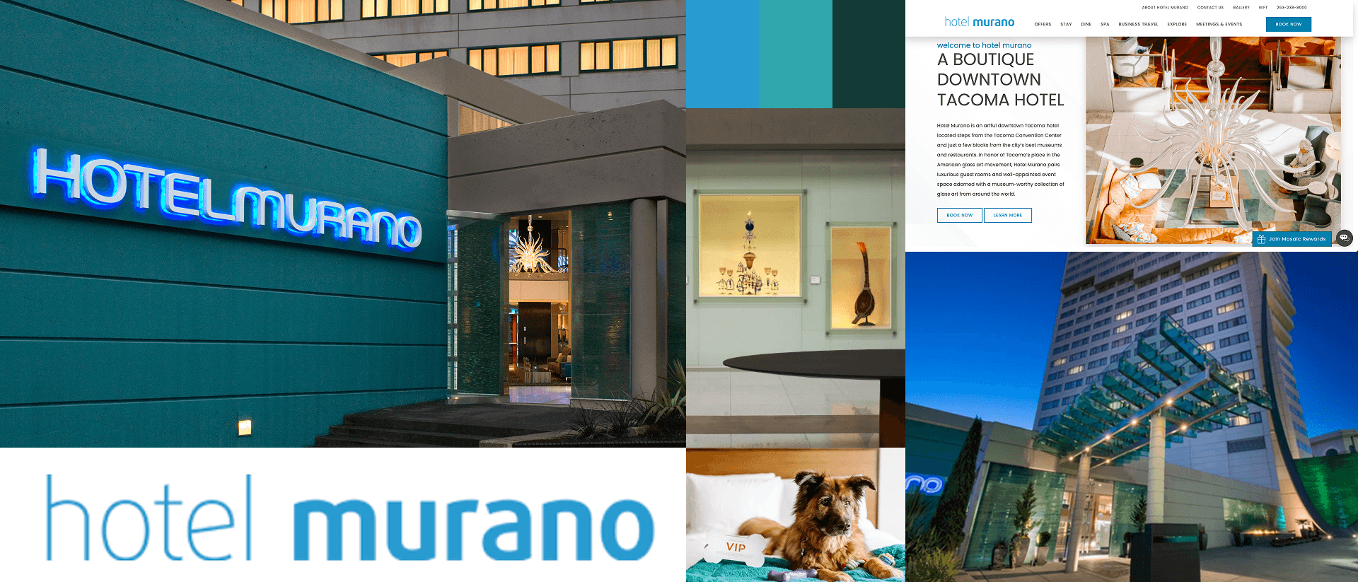
Luxurious. Energetic.
Artistic. Inspiring. Exploratory.
Luxurious. Energetic.
Artistic. Inspiring. Exploratory.
Luxurious. Energetic.
Artistic. Inspiring. Exploratory.
REBRAND PILLARS
REBRAND PILLARS
ideation
ideation
Moodboarding & ideation.
Moodboarding & ideation.
Moodboarding & ideation.
Utilizing those brand pillars, I crafted two distinct directions to explore into, both deriving directly from the glassforms that Hotel Murano is incredibly proud of.
Utilizing those brand pillars, I crafted two distinct directions to explore into, both deriving directly from the glassforms that Hotel Murano is incredibly proud of.
The first drove more towards luxurious, artistic, and inspiring, whereas the second was more energetic, artistic, and exploratory. In the first, I was particularly interested in using the ligatures of the typography to evoke pulled glass.
The first drove more towards luxurious, artistic, and inspiring, whereas the second was more energetic, artistic, and exploratory. In the first, I was particularly interested in using the ligatures of the typography to evoke pulled glass.

MOODBOARD: direction 1

MOODBOARD: direction 2
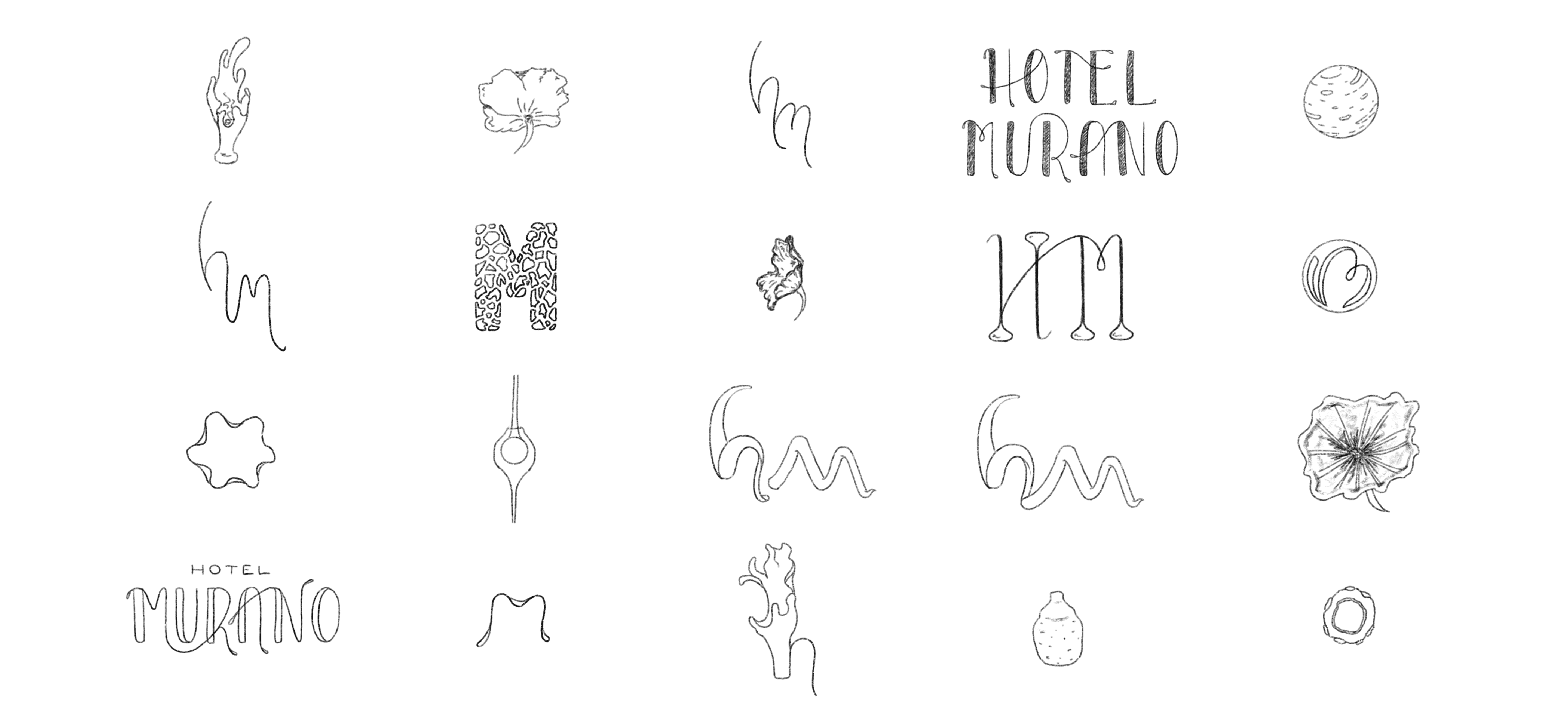
INITIAL SKETCHES

BRAND MARK iterations
MOODBOARD: direction 1
MOODBOARD: direction 2
INITIAL SKETCHES
BRAND MARK iterations
MOODBOARD: direction 1
MOODBOARD: direction 2
INITIAL SKETCHES
BRAND MARK iterations
MOODBOARD: direction 1
MOODBOARD: direction 2
INITIAL SKETCHES
BRAND MARK iterations
Final rebrand
Final rebrand
Something far more apropos.
Something far more apropos.
Something far more apropos.
After critique and ideation, I ultimately decided that the first was the most fitting, and most captivating.
After critique and ideation, I ultimately decided that the first was the most fitting, and most captivating.
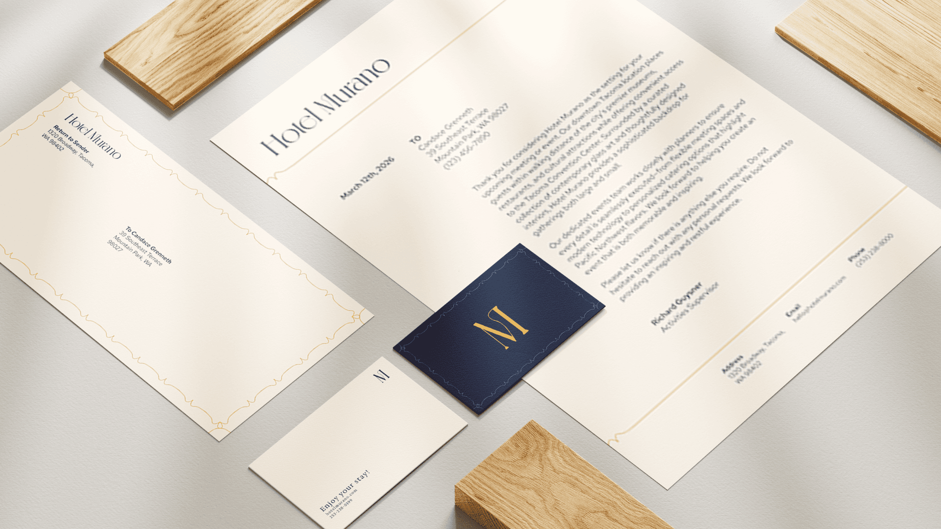
I believe the final rebrand gets at the core of how Hotel Murano wants to present itself. The contrast between the dark blue and bright gold evokes that of blown glass, and the central logo evokes the pulling of the glass.
I believe the final rebrand gets at the core of how Hotel Murano wants to present itself. The contrast between the dark blue and bright gold evokes that of blown glass, and the central logo evokes the pulling of the glass.